Thursday 8 October 2009

Rationale

Keeping a blog is not something I would have thought of as being helpful to the design process, but it has really helped me focus my thoughts and ideas. I approached this blog as a memory bank of things that I find interesting, funny and relevant and tried to regularly update it. Some of the thing I posted I have come across recently, such as the £45 pound horror move called Colin, and others are things that I have known about for a while and have stayed with me, such as the Betty Pepper jewelry and books, which I saw in an exhibition in Birmingham about 5 years ago.

I have had the good fortune to travel a bit this year as I have just returned from a year abroad in America. That coupled with the frequent trips I like to take to France has played a key role in some of my posts. Whilst in America I was exposed to new ways of creating images and type, such as using the photocopier, letter-pressing, screenprinting and photography. This helped me develop as a designer and move away from solely computer based work and using illustrator when I can't get images I want myself. This lead to some posts about alternative image generations such as Photocopier art.

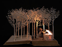
Whilst I was away I also focused a lot of book design. I looked at and designed a wide range of books and really enjoyed it. It was interesting to see that a number of my earlier posts where to do with Book design and book making. The variety and range of books is fascinating to me, and I now have a keen interest in Book design and would love to explore this are further. I was interested to see how other designers had pushed this medium further and made dioramas, coffee table lamps and jewelry cases from them, 'Su Blackwell', 'Light up' and 'Betty Pepper'.

Product design is another area that I found really interesting had not initially planned on exploring. I found it really interesting to see how designers had changed the appearance and in some cases function of a product to make users think about it in another way. In particular 'Bright Idea', where audiences were encouraged to Think and write down their ideas no matter where they were. It made me laugh and it made me think about the multiple uses for products and how some things can have many functions and how things can be altered to fit a purpose the weren't initially designed for.

Film was another area that I explored and I really enjoyed as I love watching Film but don't always critique them from a design prospective. I was surprised by some of my choices but felt that what I chose to show were examples of things that appealed to me cinematically. This is evident as one of the films I looked at "Life is Beautiful" inspired my Extraordinary Ordinary Project. I also found that film crossed into other mediums, particularly Type for instance in the music videos "Do your thing" and "Good Life".

Typography is not an area that I usually feel particularly confident about but I was gratified to see some comments on this subject. The Typography Pop Up book is one that I really enjoy, because in my Type classes we really focused on the mechanism of type and how type is constructed to appear unified and coherent. So the letter m is formed using the letter n, in a similar way the letter r and n are related as they are formed in a similar way to each other. In this way all letterforms are linked an reflected in each other.

Advertising was a fun topic to explore. It is interesting to see the original ideas and angles advertisers approach problems from and the fun solutions they come up with. I noticed this in other peoples posts, including Alex Rennies on Charity logos and how inventive they have to be,and his packing design post on chocolate. Also in the post 1+1=3 advertising through body language, the discussion on advertising in real-life shed light on how advertisers are getting away from conventional methods and really pushing the boundaries of sponsorship and promotion.

Design was more of a reflexive subject area for me. I looked at aspects of design personal to me, from knitting, to bad design, to things that I've seen that interest me. I also did a blog post of Neil deGrasse Tyson an Astrophysicist who included a section on bad design in nature, that explores the idea of just how evolved natural design in. As designers we are always looking to nature for inspiration and guidance on good efficient design, yet Neil deGrasse Tyson argues that nature is the exact opposite of intelligent design and points out key areas of Stupid design mistakes that no modern designer would make.
Graphics/Artworks and Animation really focused my mind on designers and styles that I liked and admired. I am really interested in illustration and favour simplicity over complex and difficult. I liked areas of design where alterations and effects were subtle and had great impacts, such as "When designers get bored", here slight alterations went a long way in changing he message. Similarly "Inner Child" switched a well known phrase to apply new meaning to the museum experience. Similarly "Animator Vs Animation 2"
plays with the well known visual language of the Microsoft Interface and creates an amazing animation that explores the everyday symbols and logo we encounter and disregard.

This blog has made me open my eyes to what I encounter everyday and pay attention to what I like and dislike abut it. I have used many resources to gather this archive, from Tv, Cinema, Newspapers, Books and Internet. I enjoy recording my findings and hope to continue with this blog as it has been and will be a useful resource in my work.

Arcade Fire

This is a 3D computer animated video produced for Canadian rock band Arcade Fire by Plates Animation.

Marumiyan


Marumiyan is a Japanese Graphic Artist whose strong cultural influence is evident in his work, yet still modern and exciting. In particular I love his use of colour although I think his subject matter is a little cliched, floral, fauna and the feminine form have been done numerous time, but I think he brings something new to the theme, though I definitely prefer his edgier work. He is saved from blandness by his excellent use and understanding of colour.

War and Peace


War and Peace is a poster by Kentaro Nagai as part of his collection "Piece together for Peace". Nagai has done similar works, for instance Twelve Animals is a collection that shows different Countries of the world arranged like animals. This body of work has come from his concern about the direction humanity is taking. He views the economic crisis as a unique time for human kind to take stock and make changes to our way of life. I really like his imaginative use of the map to recreate a human skull, aside from the politics behind the work I think it is a good lesson in how looking at everyday objects in a new way can lead to creative and inventory ideas.

Inner Child


I was on the D and AD website looking at some of the winning entries sent in from last year and this poster caught my eye. I liked its simple and clear message and its use of colour, but what really grabbed my attention was the copy. I always find that the best copy plays on everyday language that we encounter. My subverting the usual "All children must be accompanied by Adults" phrase that we usually see in amusement parks etc and switching it to "All Adults must be accompanied by inner child", its appealing to the playful side and changes your view on enetering the museum from serious to enjoyable.

Designer Paul Pateman

Billboard


Here are some fantastic billboard adverts that really push the medium and exploit the size and location for maximum impact.

Monday 5 October 2009

Bad design

Neil deGrasse Tyson is an American Astrophysicist and Atheist and charismatic television personality. He makes the argument that whilst we always extoll the virtues of nature and how cleverly it is designed, in actual fact there are many significant flaws in the design of nature that any intelligent designer would never make. He makes some quite interesting points, and is very humourously put. My favorite is his argument that sex and excretion occur in the same area, and hat no intelligent designer would put an entertainment area right next to a sewage system.

Light up

Book of light is a Linen bound hardback pop-up book, that open up to produce a lamp. The cleverly disguised LED lamp comes in two styles, traditional Victorian and Parisian street lamp. A grown-up version of the children's pop-up book it is intended to be used as a quirky coffee table lamp. Its a clever idea, incorporating reading and lighting together, it is also portable. However it is not very bright as it runs on three 0.6 watt LED's, but its such a brilliant design it's worth it's $95 price tag.

Half Baked

This book is a food report designed by a Croatian Ad agency which require the book to be baked for 20 minute before it can be read. Entitled 'Well Done' the pages appear blank but are printed with a thermo-reactive ink that when wrapped in foil and baked at 100 degrees will reveal text and images. If you set the temperature too high, as with any meal the book will burn. This is a brilliant example of how lateral thinking can be applied to what at first seems a mundane book.

Thursday 1 October 2009

Friends of the Earth

Pollution is closer than you think is a Friends of the Earth campaign designed to make people think about the air that they are breathing and the water that they are drinking, and how close to pollution they come in their everyday lives.

One for the Girls

These ads prove that point of sale can be more imaginative than just decorated shelving. Both these ads have been designed to capture the interest of passers by in a memorable and interactive way.


Save the trees


This advert aim to get us to reduce the amount of toilet paper we use. Over 250,000 trees are cut down each year and subsequently flushed down the loo. By getting the user to make the connection with the source of the product, hopefully they will reduce their consumption.

Can't touch this

This advert plays on the brands main selling point. Its simple direct and very effect in getting across its message.

Western Spaghetti

This is an amazing animation, showing how graphic designers cook up their ideas.

Things I've seen

Los Angeles

Venice

Nice

Mexico

I am lucky enough to have had to opportunity to have travel, these are some of the interesting architecture and structure that I have seen.

Wednesday 30 September 2009

The island of Sans Seriffe

This was found in the Guardian website, its absolutely brilliant well worth a read.
http://www.guardian.co.uk/theguardian/1999/apr/01/features11.g24


Su Blackwell

Su Blackwell makes interesting dioramas out of books. Her work has a fairytale quality, which is relevant due her choice of medium. 
Wild Flowers

The Old House

Pandora's Open Box

Chatsworth Derbyshire, A Guide to


I think he may have hated women

As I mentioned earlier I visited Les Musee des Beaux Arts in Nice and was introduced to the work of Gustav-Adolf Mossa for the first time. His work is hung in a small room and immediately on walking I loved it. The drawings are morbid and fascinating, accompanied by french text you don't need to be fluent to know that there is something very PG18 going on. Most drawings feature cat-like women, blood covered male orgies and heart ripped from still warm chests. It's Emo but 1950's and far more attractive to look at than a My Chemical Romance album cover. On getting on to the internet and doing further research I was able to find out that Mossa was a key member of the Symbolist movement, into decadentism, orientalism, spiritism and satanism, love of masques and masquerades, androgynity or hermaphradotism, to name but a few themes evident in his work. In short he likes theatrical weird stuff, which is great, I love the drama but his drawing are more than disturbing.
This one is called Lui a portrait of Elegabalus, preparing for a dance performance, in the background, the audience, men decked out in evening dress, are waiting to see his performance. Inscribed with the words "Et alors, il contrefaisait la voix et les cris des jeunes filles auxquelles l’on fait violence,” ‘And then, he imitated the voice and the cries of the girls that he had raped.’ Weird but I like it. 


When designers get bored

Apparently this is what graphic designers do when they get bored. Personally I eat but producing work like this would be a much better use of my time. Highlight is clip 1.58 where pandas are made to look like the band Kiss. This is a great exercise in seeing the potential in objects beyond their initial use.

My first day at school

This is an animation by a graphic student. I've seen many animated type videos but this is one of the most successful. The poem is My first day at school by Roger McGough, a poet I remember reading and listening to as a child in primary school. The style of the animation being chalk on a blackboard is obvious, but saved by the way in which he treats the lettering using them to represents children in playground by the way they move move and swarm across blackboard is so representative of children racing round a playground.

Tuesday 29 September 2009

Rodin Museum


Auguste Rodin has always been my favorite sculptor. The way in which he captures the tension and life of the human body in such a passionate and unrestrained way has always appealed to me, and a few years ago I went to the Rodin Museum in Paris and it was one of the most enjoyable afternoon. I took a friend with not much interest in art and even less in Rodin but by the end she was a convert. The Museum is both indoors and out, and features many well known works such as The Kiss, The Gates of Hell and The Thinker. The mythical stories behind the work add to the energy and beauty of the pieces, and the sense of fantasy captured in a moment.

Les Musee des Beaux Arts


On a recent trip to Nice, France I visited Les Musee des Beaux Arts a museum established in 1928 in a beautiful house orginally built for a Ukrainian Princess. The collections of the museum are extremely varied and included the work of Jules Cheret, Raoul Dufy, Auguste Rodin and Gustav-Adolf Mossa. I love French museums because I feel they do more to incorporate art outside the museum building as well as in. Whilst sat in the wonderful gardens facing an amazing fountain/sculpture which frames the palm trees and foliage of the brilliant South of France, I contemplate the grandeur of the building, the sweeping staircase designed to accommodate a small orchestra, the large vaulted ceilings and marbled flooring seem almost more impressive than some of the artwork that adorn their walls. But this may be due to the fact that this grand home was designed to hold such things. I cant help but feel that this sculpture nestled within the foliage seems more at home than the other works of art within that indifferent, perfect building.

V for Vendetta

V for Vendetta is a dystopian film, set in near-future United Kingdom. It follows a young woman, named Evey who is rescued one night by the vigilante V, a masked, sword welding, smooth talking freedom fighter, who wants to save England from the fascist totalitarian government, who keep order by inducing a high state of fear amongst the population. From that night her life changes and she joins V in his fight to effect change and pursue his own personal vendetta. The story of Guy Fawkes and the bon-fire plot is a strong theme in the film and is used to great effect to create that unnerving this-could=happen feeling that is a integral to achieving a dystopian feel. Hugo Weaving plays the part of V and it is a testament to his acting abilities that he is able to achieve such nuance is his performance as he spends the entire film in a mask. The Guy Fawkes mask with its stretched grin would stifle lesser actors performances but Weaving is able to project his emotions past the masks expession, with his voice and his body language (also difficult as his is wearing a body-swamping cape). This is my faorite scene, the alliteration is very impressive and the delivery is faultless, and I have to admit to having needed a dictionary a few times.

Monday 28 September 2009

Life is Beautiful

Life is Beautiful is one of the most heartwarming films I have ever watched. Written, directed and staring Roberto Benigni as Guido a Jew living in Italy in the 1930's. The first half of the film sees Guido, meet, court and marry a local woman and start a family. I found this half of the film slow moving and boring, full of slap stick comedy and completely at odds with the rest of the film. The real joy of the film is in the second half which sees Guido and family moved to a concentration camp. Him and his wife are separated but he is kept with his young son, who he lies to and convinces him that it is all a game and that they are competing to win a tank. It is strange to have a comedy set in the holocaust but in a way the sweetness of the comedy makes the true horrors of the war more poignant. Guido must be creative and quick-thinking to protect his son from the truth as well as from the germans who will kill him as he is too weak to work. Many criticise the absurdity and implausibility of the premise but I find that if u suspend disbelief you can really get into it, and begin to feel for the characters. My favoriite scene is when Guido is hard at work moving rocks, and his son runs in saying the other kids are having a shower but he doesn't want one, tryiing to hide his son from the Germans Guido tries to persuade his son to go and have a shower, little realising his son has just escaped the gas chamber by refusing to go.

Do your thing

Another absolutely brilliant music video. This time incorporating t-shirt design and typography. Again it shows the expressiveness of type, which so many designers ignore in place of image. The guy with the trumpet t-shirt is an absolute dude though.

Good Life

This video may be responsible for all the homemade typography music videos, but they say imitation is the highest form of flattery. I really like his music video and think it is one of the bet simplest ideas, and a good example of how typography can be used expressively to add nuance and paint an accurate picture of a mood or scene. It's good to see really great entrepreneurial use of typography, especially in a hip hop video that could so easily have just been full of cars and hoes. 

Animator Vs Animation 2

I'm sure you've seen these before but I love these animations so much, I think the way the play with the well known PC interface is absolutely brilliant. It's something to aspire to. 

Photocopier Art


http://www.marisagonzalez.com/home_in.htm

During my year abroad in North Carolina State University I was introduced to different ways of creating images and type. One of the most exciting and fun was Photocopy art. The application of a colour photocopier is far more advanced than just reproducing duplicates of an image. You can play around with colour, transparency, negatives etc. It can allow you to experiment and create varied and intriguing images and when you know what effects you want, you can create some amazing effects and illusions. One of the best features about using the photocopier is the physical quality of the finished image, particularly when you've layered image on top of image, you can see the images below coming through and it give it a certain quality that whilst you can produce the same image on a computer, you don't get the same effect of seeing the process that went into making it evident in the image. In the same way that Warhol's screen prints are unique, the way the ink sits on the page and the individual marks and scratches of the machine create unique indentations on the image, that to produce the same image again and again results in slight variations individual to each print. The colour quality is also impressive, you can get a wide variety of tone from grainy, faded to strong colour blocks, and as you run the page through the copier again and again the image quality can degrade in a way that a computer can't reproduce. As students we are always being told to step away from the computer. It can be used to fake a lot of different media, but there is something unmistakable about the authentic thing and being so used to the computer, when you produce an entire image without it the final result is so unlike anything else you've every produced, from the colour, style and print quality there is an overwhelming sense of the designers hand in it that is exciting and instantly notice able.

Saturday 26 September 2009

It's Business time

These are excellent examples of the importance of having a well designed memorable business card, and how imaginative you can get with them. The hairpin business card is my favorite as it is clever, useful and fun, a stroke of absolute genius.


Friday 25 September 2009

Shock Horror

This is the trailer for Colin The £45 that has apparently taken Cannes film festival by storm. Filmed on a 10 year old standard camcorder, and edited on a home PC it was written, filmed, edited and produced by one man, Marc Price and took 18 months to complete. Whilst most of the hype stems from its ridiculously low budget of £45, which was spent on a crowbar, ketchup and some tape. Price was able to keep his cost low by advertising for extras and volunteers on facebook, and getting them to bring their own lighting equipment, make-up etc. This film also breaks new ground, in that it is the first zombie film told from the zombies prospective and focuses on the relationship between Colin (who changes within the first few minutes) and his sister, and what he witnesses whilst out on a carnivorous rampage. Critics have called this one of the best indie films this year and some viewers at the Cannes film festival reportedly cried (tears of emotion, not pain). 

Tuesday 22 September 2009

Oh no they didn't


This may be the most unfortunate, ill-conceived logo design ever. Designed for a non profit organisation, this is an excellent example of how there is such a thing as a wrong solution.

Monday 21 September 2009

Tying the knot


I remember reading an article a couple of years ago about a couple so fanatic about knitting that they had an entire knitted ceremony where everything from the cake to the flowers where knitted and guest even knitted throughout the entire ceremony. I have found some pictures from the wedding, and whilst its not the way I would do it I applaud them for incorporating their passion into their special day.


Knits


I've been knitting for the last two years, nothing adventurous, just scarves and beanie hats. I'm trying out mittens at the moment, and hopefully, one day maybe a cardigan, who knows. Here are some more professional knitters work, who show the medium isn't as fuddy- duddy as you might think.


Bright Idea


What do you do when inspiration strikes, but you're on the loo? 
Designed for the School of Arts "Think" campaign, to encourage people to think and write down their ideas, no matter where they are. It think its a good simple idea, and the strongest object is the loo roll as the toilet is a place where you have time to stop and think.


Sunday 20 September 2009

On the Shelf


Here are two alternatives to boring flat pack shelving. Both turn functional storage solutions into interesting wall art. My favorite is the seemingly suspended books and towels which I'm sure will confuse visitors, though the geometric characters are a playful, grown up design alternative. 


Sinking feeling


The clever drainage system of this interior designed sink made me smile. 

British Summer

Says it all really.